Blog
Warm or Cool Handbag Hardware? Compare the Photos Before Choosing

Hardware is easy to notice in a close-up and easy to misjudge when choosing between two handbags. A small turn lock photographed in warm light may look more yellow than a larger chain photographed against a neutral wall. A polished plate can pick up the colors around it. A brushed surface can look muted even when its underlying tone is similar. Comparing the finish well means reading the listing and the whole gallery together. It also means deciding how much you want the hardware to stand out at the distance from which you usually see the bag.
Identify the finish from the listing before judging the color
Start with the exact name and reference of the listing. When it says gold hardware or palladium hardware, write those words down as the store's description of the visible finish. The words give you a starting category for comparison. They do not establish the underlying material, plating thickness or resistance to wear. If the composition matters to you, ask what information is available for that exact item. A photograph cannot verify it.
Next identify which parts the description appears to cover. A front lock is an obvious place to look, but the handle rings, strap clips, zipper pull and small attachment points may be visible too. An image of the front plate does not tell you whether every component has the same finish. Use the gallery to see which details you can actually examine, and put a question mark beside the ones that are missing from view. If the title and the selected variant are not clearly aligned, save the listing and ask before making assumptions.
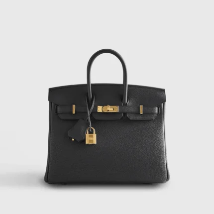
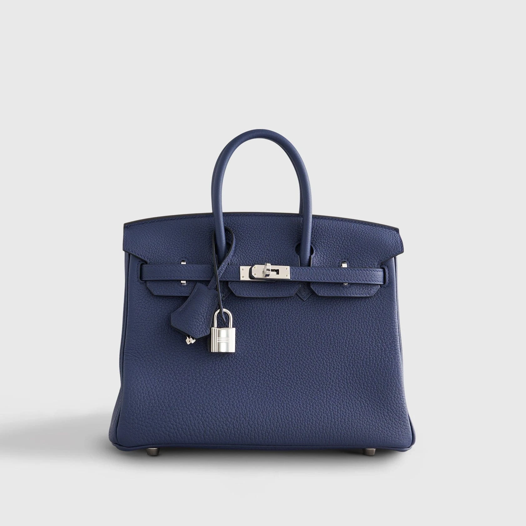
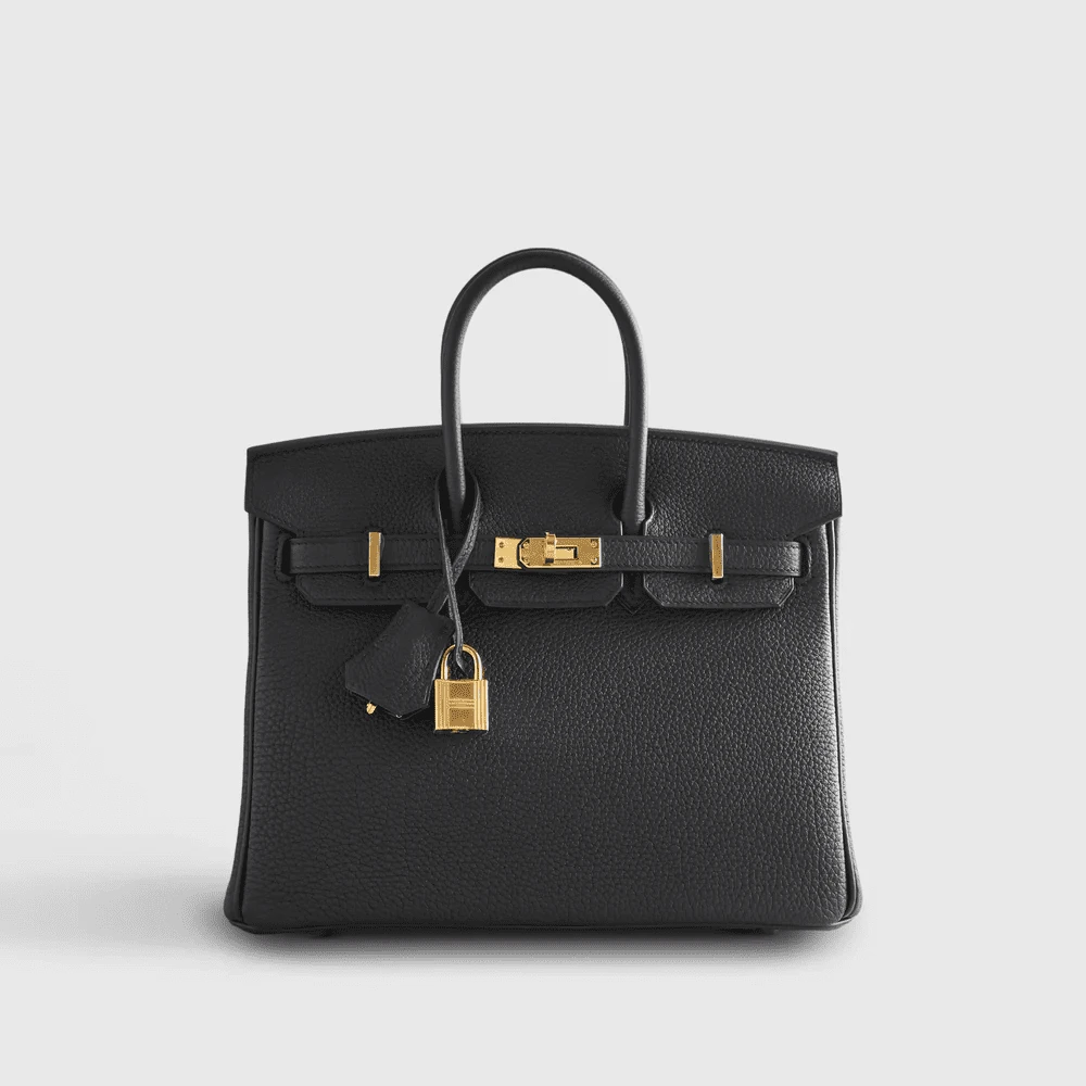
Several examples give you a starting point on Integrity Bags. The listing for Hermès Noir Birkin 25 Togo Gold Hardware uses the gold designation in the name. The Hermès Birkin 25 Togo Blue Navy Palladium Hardware and the Hermès Birkin 25 Togo Etoupe Palladium Hardware Retourne use the palladium designation. These are store listing labels. Compare them across their galleries as separate products, not as proof that one item could be ordered in all three combinations.
Pick comparable angles in both galleries
Open two listings in separate tabs. Choose a straight front view from each gallery before moving to the close-ups. Use the same display and similar brightness, and avoid using a heavily tinted display mode for the comparison if you can. Compare what the plate or clasp looks like relative to the rest of the bag. Then choose an angled view of the same component and see whether the impression holds. A single photograph can make a highlight look more prominent than it normally appears.
Next choose one close-up for each listing at roughly the same scale. Comparing a tight macro photograph with an entire bag can exaggerate the importance of the visible metal. The goal of the close-up is to see the transition between highlight and shadow. The goal of the full view is to judge how much attention the hardware draws in the complete silhouette. These are different decisions. A finish you like close up may feel too quiet in a full view, while a finish that looks dramatic in a detail shot may feel balanced on the complete bag.
Avoid comparing the colors of two different components as though the angles were interchangeable. A rounded ring reflects from a different direction than a flat plate. A chain link may have bright edges beside dark gaps even when the finish is consistent from link to link. Compare one closure with another closure and one strap attachment with another attachment where the photos allow it. If the gallery does not provide a useful matching view, make a note of the limitation. A careful shortlist can include a question rather than a confident ranking for every detail.
Repeat the full-view comparison once with the images reduced. At a smaller size, color matters less than contrast and the total area covered by the hardware. This is closer to the effect of seeing the bag across a room. If the detail only bothers you when zoomed in, weigh that against how often you will actually see it at that scale.
Read the neighboring colors as well as the metal
A finish can look warmer next to a cool body color and quieter beside a tan or amber tone. The body color is the larger surface, so it sets the visual context for the hardware. Hold your attention on the boundary where the metal meets the bag rather than on the brightest spot. Ask whether the finish clearly separates from the surrounding color, gently blends into it, or draws the eye to one specific feature.
The two palladium-labeled Birkin listings are useful here because their body colors differ. Compare the navy listing with the Etoupe listing using views that show both the hardware and the panel around it. If one example looks stronger at a glance, the reason may be contrast with the body color or the lighting in that photo. A practical buyer can use that difference to choose a look without claiming that either image reveals an exact underlying metal color.
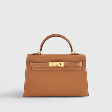
The Kelly Mini Epsom Gold Sellier Gold Hardware offers a different pairing to compare. Use it to observe the relationship between a warmer body color and a warm-labeled finish. Then return to the black Birkin listing to see how that broadly similar finish designation reads against a darker body. The two product families do not have identical layouts. The comparison is still useful when the question is how clearly warm hardware stands away from the surrounding color.
It is also worth comparing the strap or handle attachment against nearby material. Small areas of contrast may appear on the outside edges rather than the center. That can feel subtle while the bag is resting and more noticeable when the handles move. A still photo cannot predict every angle, but the front, side and back views together can reveal where those points are placed.
Separate the surface finish from the color family
Polished, brushed and muted-looking surfaces reflect light differently. On a polished surface, a clear bright reflection can be concentrated into a small area. A brushed-looking surface may spread the highlight and show a directional texture. A finish that looks subdued in one photo can look brighter in a second photo taken from a different position. Look for a pattern across views before deciding that the surface is consistently matte or highly reflective.
The difference matters in daily use because the apparent brightness can change with movement. A plate on a bag held directly in front of you is presented at one angle. A side clip worn on the shoulder turns as you walk. If you want a low-key look, pay attention to the pieces that move rather than focusing only on the static front clasp. If you enjoy hardware as a visible detail, compare which components will actually be seen in your usual carrying position.
Use gallery close-ups to identify visible seams, edges and shadows around the finish. A sharp reflection can make the edge look paler than the flat center. Shadows near stitching can make hardware appear darker. Do not read a color difference across a highlight as a defect without checking another angle or asking for a clearer image. The purpose of a close-up is to clarify what you see, and some lighting setups make that difficult.
Product photos are also a limited source for predicting patina, marks or scratching over time. Image compression, lighting and the display itself can conceal small marks or amplify them. If long-term appearance matters, ask for care instructions relevant to the finish in question and use only methods appropriate to the item. The comparison here helps choose a visual preference and does not settle how the hardware will age.
Compare the visible amount and placement
A quiet clasp and a broad chain can both be described as warm hardware. They create different impressions because the amount of visible metal differs. Study the overall image and identify the pieces you see first. Are they grouped at the center, spread along the strap, or visible mostly at the sides? One strong focal point gives a different look than several smaller points of shine. This distinction is often more useful than trying to match a specific shade of gold to a photograph of a buckle.
Look at how those parts relate to the way you carry the bag. If you usually tuck a shoulder bag under an arm, a front plate might sit partly under a sleeve or jacket. A chain attached near the top may remain visible across the shoulder. A top-handle bag carried at your side exposes a different set of details. Match the full-body impression in the gallery to your likely position rather than choosing based only on a flat display photograph.
Think through one indoor and one outdoor scenario. An overhead lamp can make a moving chain catch more light. In diffuse daylight the hardware might appear quieter and the surrounding color more apparent. You do not need an exact simulation. Comparing how the same part reads in several gallery views is usually enough to see whether you want more emphasis or less. Give preference to the picture that is most representative of the way you will carry the bag.
Placement also matters if you regularly rest the bag beside you or set it on a desk. The parts you handle frequently may be the pull, lock or attachment nearest your hand rather than the hardware at the visual center. Check how easy those parts appear to grasp and whether the placement makes sense for you. A finish choice becomes more useful when you also like the objects that carry that finish.
Use your wardrobe as a reference without chasing an exact match
Pull out two or three accessories you actually wear. A pair of glasses, a belt buckle or a set of earrings can be useful reference points. Place them near the outfit you most often wear with a bag. Observe whether the contrast you like is strong or subtle. An exact match among all metal pieces is not necessary for a coherent look. It may be more practical to repeat a similar amount of shine or allow one piece to act as a deliberate focal point.
Try the comparison with a coat or jacket as well as with a lighter layer. A dark sleeve can make a bright clasp stand out. A patterned fabric can compete with a dense chain or make it harder to see. If the bag will sit against a textured garment, look closely at the edges and joints of the hardware. The gallery can show the shape, although a photograph cannot promise how the pieces will feel against a particular fabric. Make that a separate comfort check.
Bring the same thinking to handles and straps. If you wear jewelry on the same side as your bag, choose whether the jewelry and the bag hardware should share attention or whether one should be more understated. If you carry the bag on the other side, the two may rarely be visible together. These choices are more useful than setting a rule that a cool bag can only be worn with cool jewelry.
When choosing between close alternatives, use one common outfit as the anchor. Compare full views of both bags and write down which feature you notice first. A short note such as “plate stands out over a dark sleeve” is easier to interpret later than a label such as “better hardware.” You are testing how the bag looks in a repeatable setting.
Verify the exact listing and put uncertainty in the right place
Keep a short record of the model reference, the wording used for the finish and the views you used for comparison. If a photo appears to disagree with the listing, describe the discrepancy rather than trying to resolve it by guessing from screen color. For example, ask whether the selected option shares the clasp finish shown in a particular gallery photo. Include the product link and reference so that the question points to one item.
The customer photo reviews give an additional view of how a bag might look in ordinary lighting. Use only reviews that clearly relate to the same product if you are checking a specific finish. A customer photo can show scale or reflections in a different setting, but it may also have been taken under unknown light or show a different option. Compare it with the listing rather than treating it as a replacement for the listing.
For a bag with an interchangeable strap, make a separate note for the clips that remain visible from the front. Open the image where that strap is attached, then compare it with the view showing the handles alone. The larger metal pieces may draw the eye toward the top of the bag in one configuration and toward the sides in the other. That change matters if you plan to switch straps often. When a listing shows multiple strap options, save the exact picture and ask which pieces are supplied with the option you are considering.
If you have narrowed the choice to two items, look at the complete bag, the close-up of the key hardware and the view that best represents your carrying position. Mark whether the finish is clearly described and whether the color and placement suit your wardrobe. Send any unresolved question through Integrity Bags contact before ordering. You should be able to explain your choice in practical terms. The finish may be warm or cool, but the deciding detail is usually how it sits against the bag, how much of it you see and how it fits what you already wear.
Compare these products